Persuasive Images: Selected Works from the Art Collections at the University at Albany
January 25 – March 31 2000
University Art MuseumGroup Exhibition
PERSUASIVE IMAGES
by Corinna Ripps
Images
Some say images have no feeling, I think there’s a
deeper meaning
Mechanical precision or so it’s seeming
Instigates a cooler feeling
I love multiplicity of screenings
Things born anew display new meanings
I think images are worth repeating and repeating
and repeating
from Songs for Drella
by Lou Reed and John Cale
Published by Metal Machine Music / John Cale Music Inc. BMI
1990
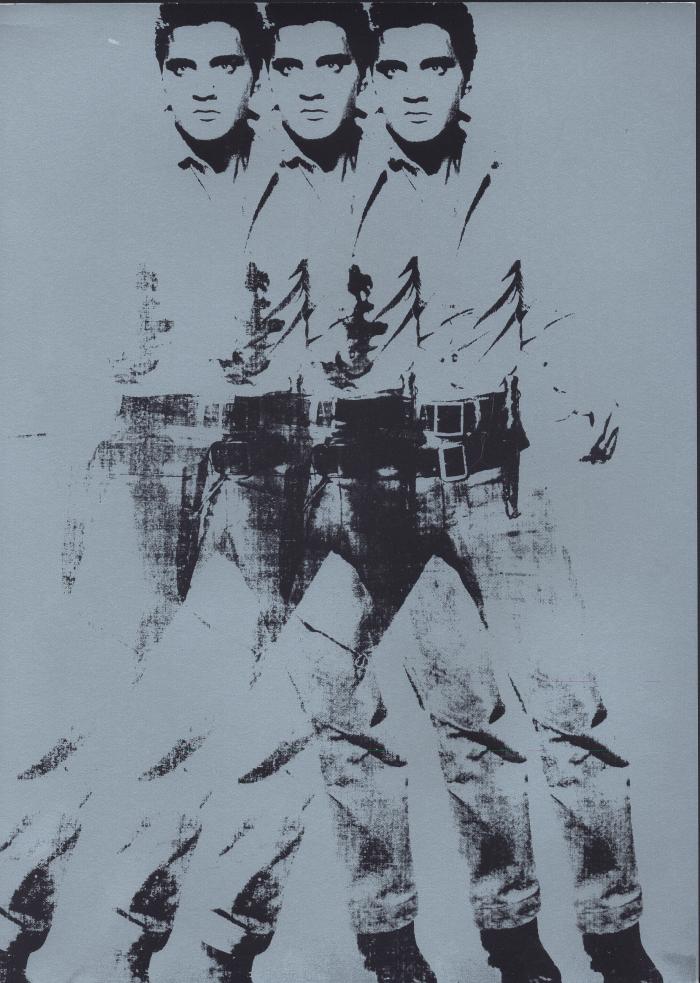
Songs for Drella, a brief musical by Lou Reed and John Cale, pays tribute to the life and times of the twentieth century’s quintessential image-monger, Andy Warhol. Warhol liked all kinds of images from all kinds of places: sad, mean, dumb, pretty images found in everyday, out-of-the-way, extraordinary places. Warhol took images from everywhere; through multiple screenings they became his, and when he finished with them he turned them back at us. His images continue to frame contemporary art and culture. They persuade us to remain detached from all that we see and know, but beneath their multi-screened and colored surfaces also lies the faint hope that seeing things anew can sometimes persuade us to know them better.
What follows is one artist/curator’s (and fellow image-monger’s) reflections on the persuasive nature of seventy-two images selected from the University at Albany’s art collections. Like Warhol’s images, my thoughts are framed by a way of seeing that takes into account a world big enough to include just about anything, as long as it makes me want to look again. At the heart of these reflections lies the important distinction that it is one thing to be an image-monger—who looks, consumes, and quickly moves on—but it is a different thing altogether to be an image-maker—who looks, selects, and slowly reveals.
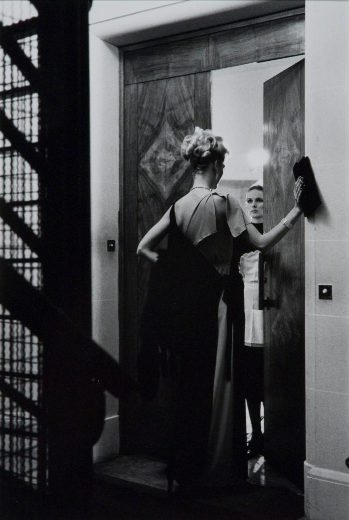
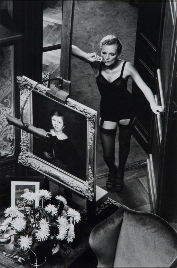
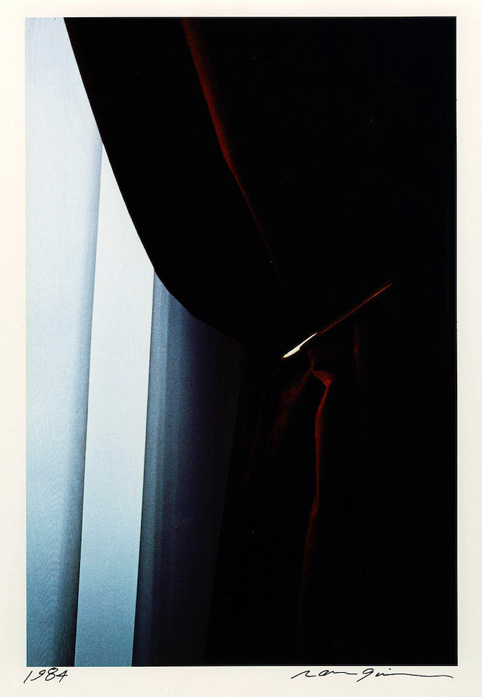
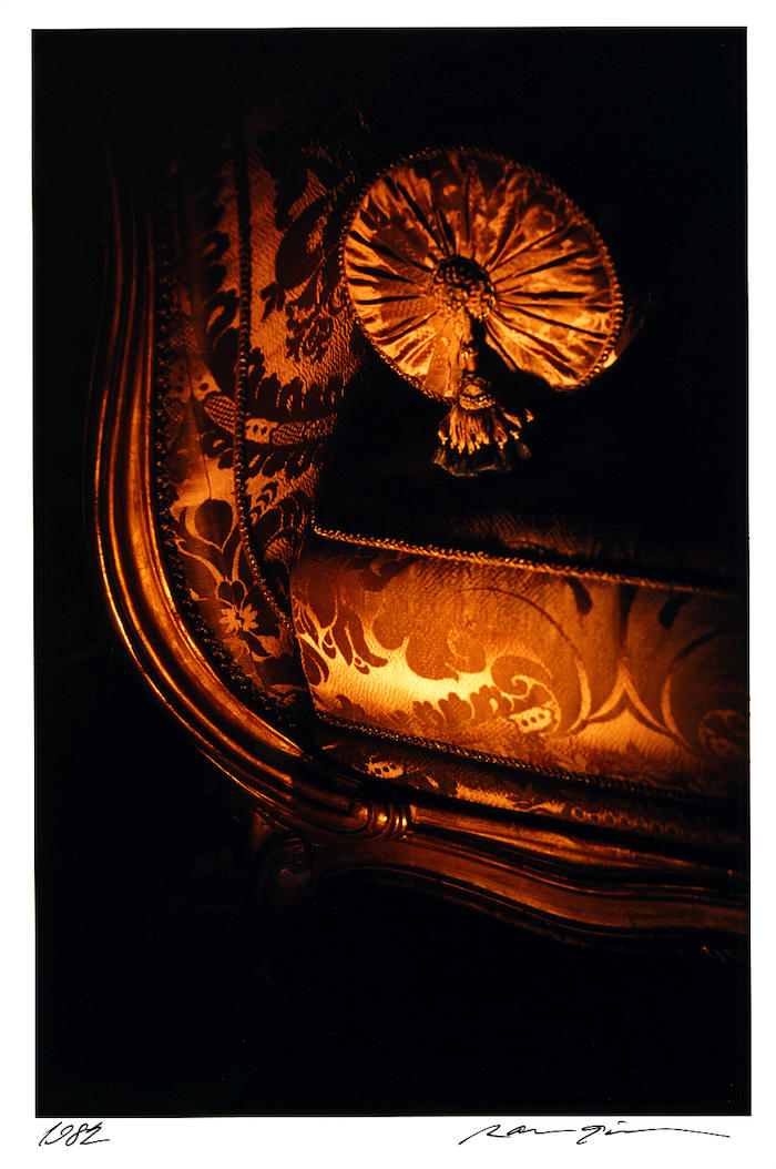
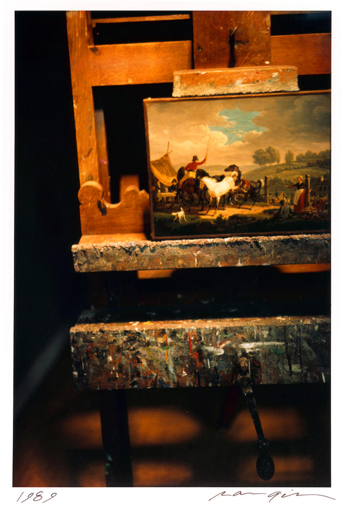
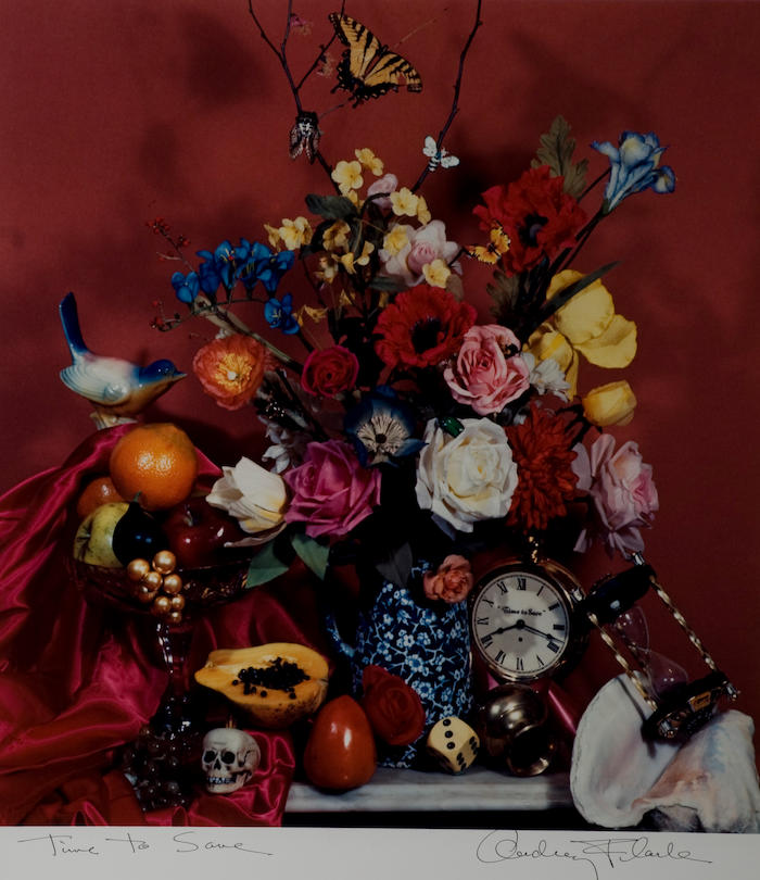
Elliot Erwitt’s photograph, New York, 1949, is an elegant and lonely view through museum doorways. The museum experience it depicts (silent, crowdless, rarified) is quite unlike the museum visit of today, now that corporate-sponsored blockbusters, digital tours, didactic label texts, and gift shop sales have changed the way we see. Compare Audrey Flack’s photograph of an overly abundant floral arrangement, entitled Time to Save, 1979, with the subtle play of grays in Erwitt’s photograph. Flack’s photograph, a contemporary take on seventeenth-century vanitas paintings, is gaudy. Its frozen lifelessness reminds me of grandiose floral arrangements often found at visitors’ desks of museums with old masterpieces. Now look at Ralph Gibson’s luminous color photographs of peripheral objects such as a curtain, a painter’s easel, or a divan, and observe how they speak of luxurious moments without being precious or pretentious. Golden and sumptuous, these photographs glow from within. Although Gibson crops his images at odd spots, the cuts are not ambiguous or arbitrary; when viewed sequentially the images become fraught with hidden meanings, temporarily illuminating a forgotten era. Erwitt, Flack, and Gibson persuade us to consider worlds that have lost their place in contemporary reality, but not their hold on our imagination.
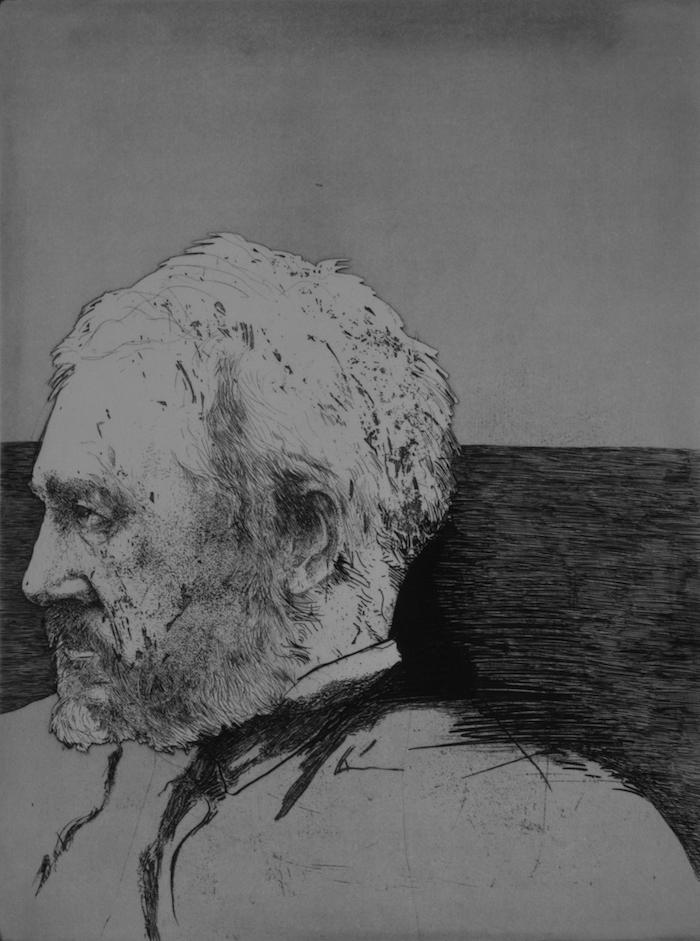
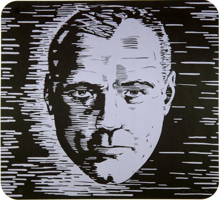
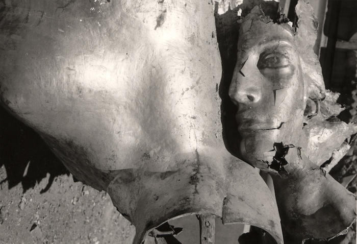
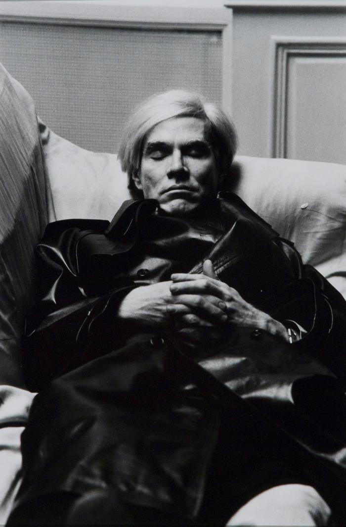
I like to think that my perceptions reflect my time and place; perhaps that’s why I long for the immediacy of the gestural hand, only to breathe a sigh of relief at the sight of mechanical reproduction. Is it nostalgic to long for a bygone state of grace? Probably, but even Warhol in his compulsive search for the blankest visage let himself be persuaded by moments of truth and beauty. Why is it that celebrity portraits taken seventy years ago by Edward Steichen seem so noble in their elusiveness, while Warhol portraits screened forty years later seem so familiar in their blankness? Why does Helmut Newton’s portrait of Warhol (taken more than ten years before Warhol died) already look like a death mask? I think it is that, despite contemporary culture’s ravenous need to move forward while appropriating, reconstituting, and regurgitating the past, through it all Warhol remains our most persuasive mirror. Eakins, 1964, is a meticulously delineated etching by Leonard Baskin done about the same time as Warhol’s first midnight-blue Jackies. But while Baskin pays tribute to the American realist tradition born out of nineteenth-century Victorianism, Warhol sheds light on a sublimated sense of loss beneath late twentieth-century materialism. The nineteenth-century desire to “make it real” is replaced by the twentieth-century urge to “make it go away.”
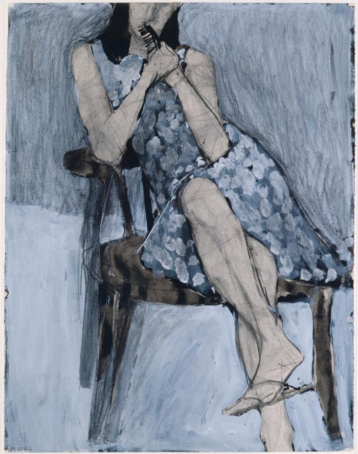
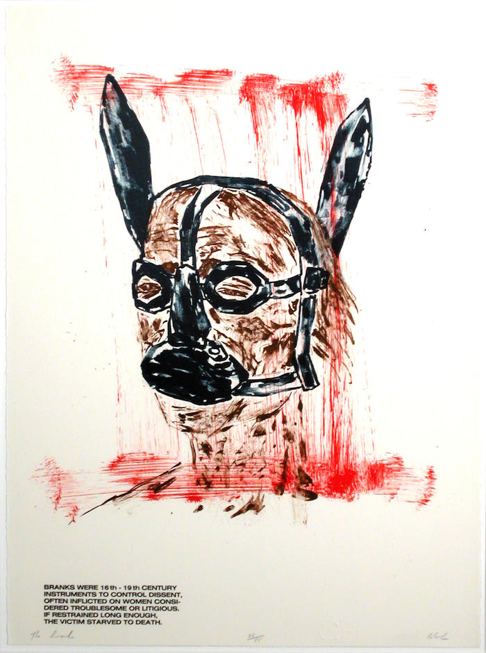
Often the artist’s hand persuades me. I look at Untitled, 1967, a lithograph by Willem DeKooning, or The Brank, 1984, a lithograph by Leon Golub, or Seated Woman No. 44, 1966, a drawing by Richard Diebenkorn, and I feel the artist’s hand sweep, scratch, and skip across the drawing surface. DeKooning’s agitated scratchy line conjures up a genderless being. Hovering in blank space, this creature is an oddly endearing example of DeKooning’s uneasy experience with figurative imagery. There is no ambiguity in Golub’s jagged lines, in his vile image of cultural force that is dispatched in uncompromising riffs of red and black. And even though Diebenkorn’s woman’s face is cropped at the lip, the artist’s rigorous charcoal lines and telling strokes offer an intimate picture of a specific woman—coy, graceful, hesitant.
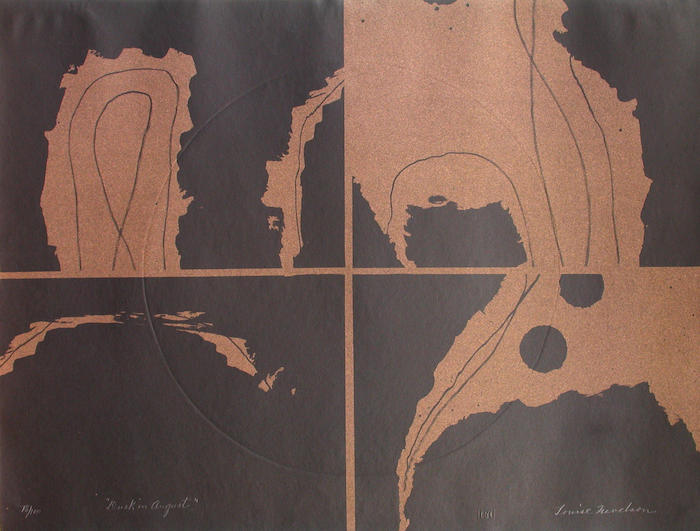
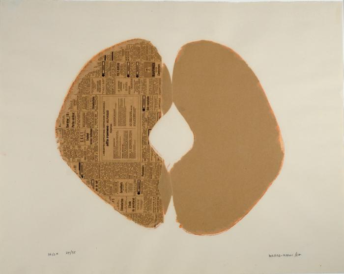
Line hitting edge sucks me in; abstraction takes me away. In William Tucker’s etching Untitled, 1986, Conrad Marca-Relli’s collograph Ibiza, 1968, or Louise Nevelson’s lithograph Dusk in August, 1967, l am again seduced by the strong presence of the artist’s hand. Tucker’s abstracted figuration, Nevelson’s mysterious world of light and shadow, Marca-Relli’s organized universe culled from scraps of yesterday’s news are all fueled by formal rigor: no room for commonplace musings here. Such elegies to pure form are calming; the focus is singular and personal; the mad race to take it all in comes to a slow and thoughtful halt. I am in the realm of aesthetic experience. I enjoy the reprieve; to be made privy to the artist’s internal world and to be seduced by it is a beautiful thing. Why, then, does it feel so exclusionary, and why do I end up staring longer at General Dynamics F.U.N., 1970, by Eduardo Paolozzi, a portfolio of collaged images from three decades of print ads, instructional manuals, and science fiction trailers? Perhaps my restless, pedestrian, image-mongering roots are showing, or perhaps the artist’s hand, with all its gestural and descriptive force, is really more about the artist’s world than the real world—my world. Paolozzi bombards us with ominous signs of a doomed culture: color-rich images of gooey food, acrid interiors, faded movie idols, crash-test dummies, and grounded rocket ships commingle in a buoyant, non-hierarchical celebration of American post-war abundance as seen through the yearning and perceptive eyes of an outsider (Paolozzi is Scottish). Embedded in his network of images is a road map of promises and dangers that drives the American Dream.
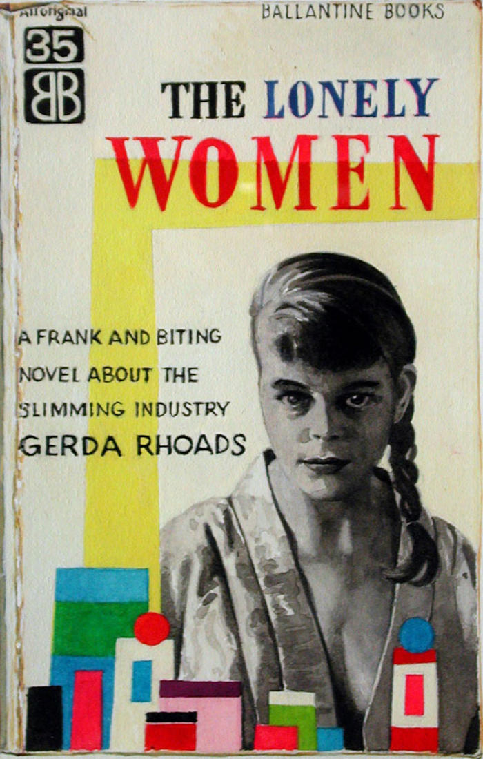
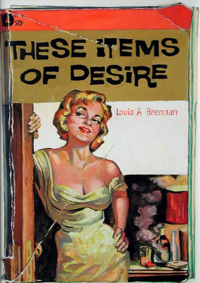
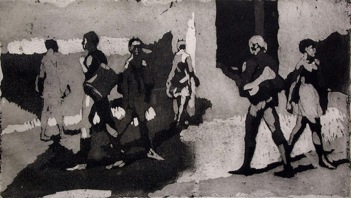
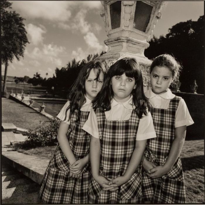
There is the persuasion of youth in America, too. Mary Ellen Mark’s photograph Three Girls in Plaid, 1986, is a wistfully intense image; Isabel Bishop’s etching Students Walking, 1971, suggests a contemplative evasiveness. Both images depict young female students who seem somewhat uneasy in their surroundings. Awkward confidence is coupled with a gnawing sense of inadequacy. Some (myself included) might say that this too is the stuff of which American dreams are made. Of course, the weight of false hope can come crashing in unexpectedly, as it does in Elizabeth Blum’s staged photographic compositions, or it can turn into unrequited role-playing as it does in Gayle Johnson’s meticulously rendered gouaches. Conversely, the work of Helmut Newton, Yasumasa Morimura, and Richard Lindner exude restrained Weimarian decadence rather than plaintive American neediness. Newton uses suggestive narrative and Morimura uses arch manipulation to create photographic images that turn the girls next door into perverse sexual icons. In We Are All One, 1967, Lindner uses razor-sharp lines to depict a man and woman physically intertwined yet emotionally disengaged. All three artists serve up a persuasive, calculated sexuality more about role-playing than genuine feeling.
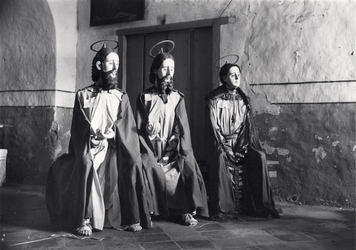
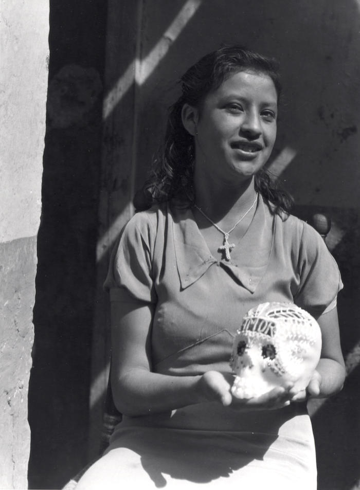
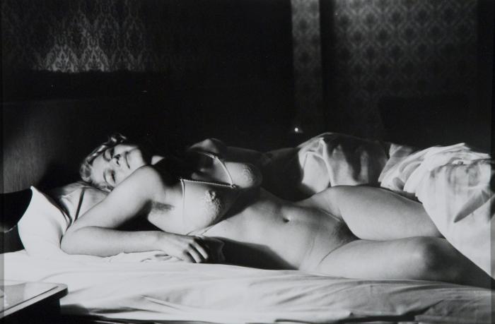
Resignation replaces titillation in the straight-up photographs of Larry Clark. In Untitled, 1963, he presents a cigarette-smoking girl who hides her vulnerability behind kohl-blackened eyes and Liz Taylor-like hair. By reminding us of their presence, Clark gives his disaffected subjects a place in the American social fabric; their loss is no one’s gain. There is a different sense of loss in Manuel Alvarez Bravo’s photographs and Manuel Guerra’s etchings. Rooted in Mexican tradition, their poetic images merge fantasy and allegory to create mysterious images filled with contradictory meanings; resignation is made whole through awareness. Here life and death mingle within the same frame, and redemption is not ruled out; it may come, but only to those who bend instead of crumble beneath the weight of its promise.
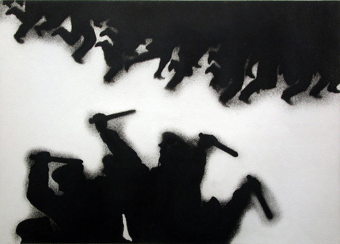
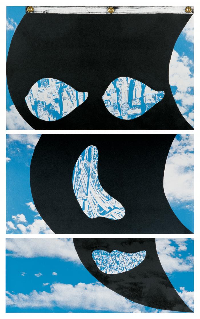
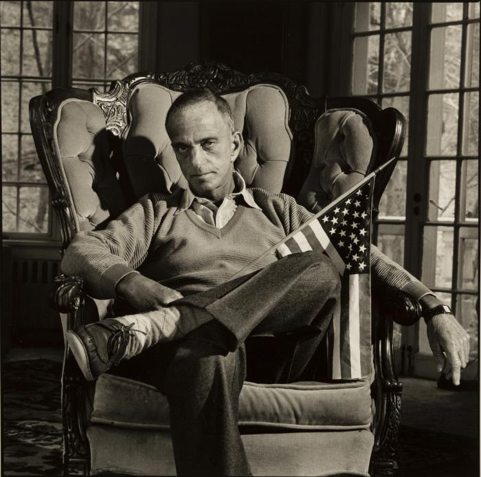
What happens when all hope fades and the dark side of persuasion sets in? In Mary Ellen Mark’s portrait Roy Cohn with the American Flag 7/1986, a casual, seemingly benign Roy Cohn languishes in an armchair holding an American flag. But forget the warm and welcoming V-neck sweater and leather mocs; look at the cocked head, tight lip, furrowed brow. The other Roy Cohn lurks here like a menacing cloud waiting to darken the view. In Flag Face, 1984, Vito Acconci carries flag-waving to different heights. An oversized lithograph segmented in three frames forms a cascading banner, and a black mask-like shape hovers over a friendly blue ground. Gaping holes become eyes, nose, and mouth through which tall buildings, tangled highways, and generic city crowds are revealed. Puffy clouds drift past. An anonymous harbinger of doom, Acconci’s menacing mask floats over the American landscape, and we know all is not bright on the horizon. In Nicholas Monro’s screenprint Cosmic Consciousness, 1970, an oversized head of Lyndon Baines Johnson floats across a patterned surface suggestive of television airwaves. Monro, a Scottish artist with an eye keenly tuned to America’s shifting fortunes, gives us an unflinching portrait of LBJ whose omnipresent image loomed over American life during the Vietnam era, when even a happy suburban kid like me knew that people were angry, divided, and dying. Like everyone else, I saw those images on television, in magazines, in newspapers. Images of street-fighting men and women like those depicted by Juan Genoves in System of Vigilance, 1971, or Broken Man, 1971, are now etched in the collective conscience. The dark silhouettes of Genoves’ figures fall in and out of view like a blurry freeze frame; their violent actions are masked by an almost lovely formal rhythm of raised fists against a blank ground.
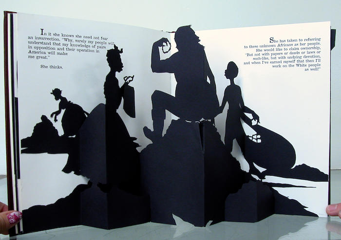
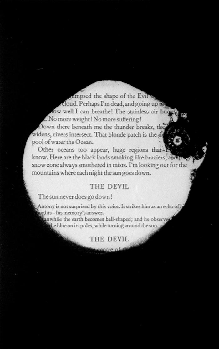
Kara Walker uses silhouetted cutouts in the form of a children’s pop-up book in Freedom, 1997, to tell the fictional tale of a nineteenth-century slave girl who dreams of living in a better world, a world where color will not matter. Her wishful vision is mocked by her white master and by her fellow slaves. The artist-student collaborative Tim Rollins + K.O.S. uses literature and visual images to tap into universal messages found in both media. In The Temptation of St. Anthony, 1989, black stains smolder across actual book pages, slowly obliterating Gustave Flaubert’s text; first words, then sentences, and finally whole paragraphs disappear beneath encroaching blackness. By stripping away extraneous information and creating visually seductive surfaces, artists like Walker and Rollins + K.O.S. neutralize images of violence and disillusionment; they bring into high relief falsehoods and thwarted dreams generated by historical biases and sublimated desires.
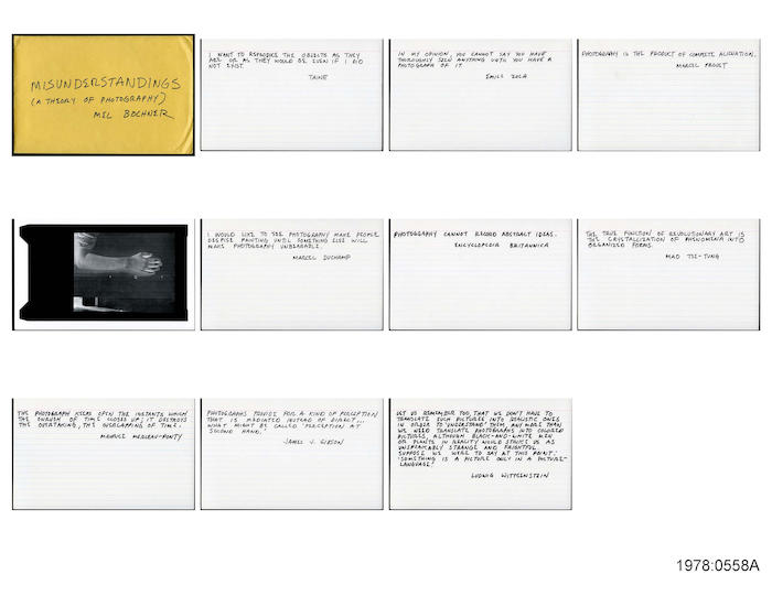
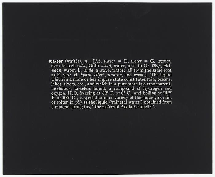
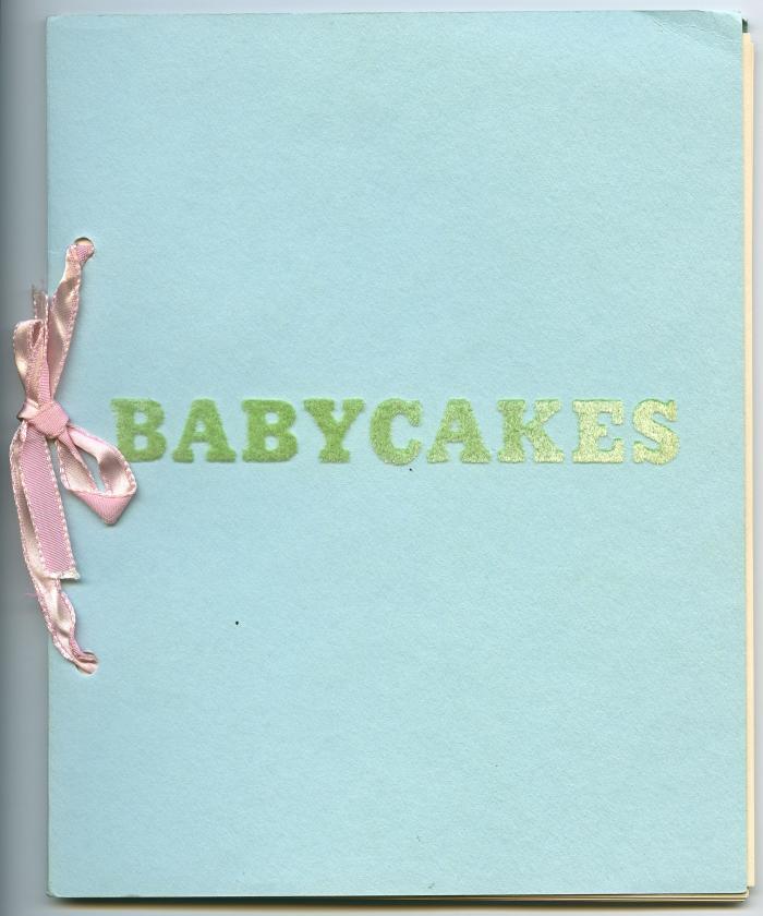
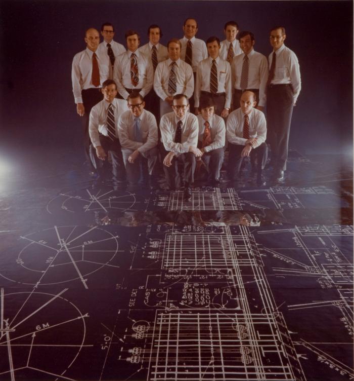
In the photographic portrait Product Managers, 1979, by Neal Slavin, a group of suited men stand watch, holding things in check as they survey the intricacies of their domain. I wonder: does their managerial proficiency extend into their personal lives, or do they live with messy contradictions like the rest of us? The hitch with narrative photography is that the viewer is always trying to imagine what happens outside the frame. Such is not the case with Edward Ruscha, Mel Bochner, and Joseph Kosuth, artists for whom facts rule. Fact devotees, these artists give the cold shoulder to Modernist photography and all its artistic flourishes. Ruscha’s tiny artist book Babycakes begins with an unremarkable black-and-white snapshot of a baby; his weight (15 pounds 8 ounces) is typed below. Each subsequent page features a different cake (a cupcake, a birthday cake, a wedding cake), with its weight (4 ounces, 2 pounds 8 ounces, 8 pounds 12 ounces) typed below. There is little room for aesthetic nuance in Ruscha’s deadpan approach. In Bochner’s Misunderstandings: (A Theory of Photography), 1969, and in Kosuth’s Notebook on Water 1965–1966, defined text is given top billing over descriptive image, only to play up the impossibility of either producing a valid depiction of reality. Bochner’s handwritten quotes on the power of photography are attributed to such indisputable sources as Marcel Proust, Mao Tse-tung, Marcel Duchamp, Ludwig Wittgenstein, Maurice Merleau-Ponty, and the Encyclopedia Britannica. It turns out that Bochner has made up three of the quotes, although he never reveals which ones. By interfering with written authority in this way, Bochner persuades me to question the veracity of authorship; all those random quotes collected at the end of Susan Sontag’s On Photography come to mind. In Notebook on Water 1965–1966, Kosuth provides pertinent facts about water: its ubiquity, its chemical properties, its dictionary definition, its potential to become ice or steam. Lackluster black-and-white images accompany the facts: a map of the world, a photograph of a radiator, a drawing of an ice cube. Such a literal presentation produces a variety of overlapping realities; it offers little in the way of aesthetic experience, yet after the intellectual burn fades, the visual components linger on—modularity, regularity, banality. In hindsight, I’d say minimalist visual strategies give conceptual art some of its best, and most persuasive, moments.
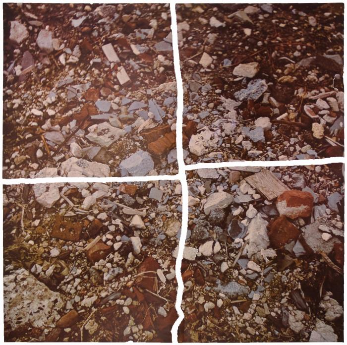
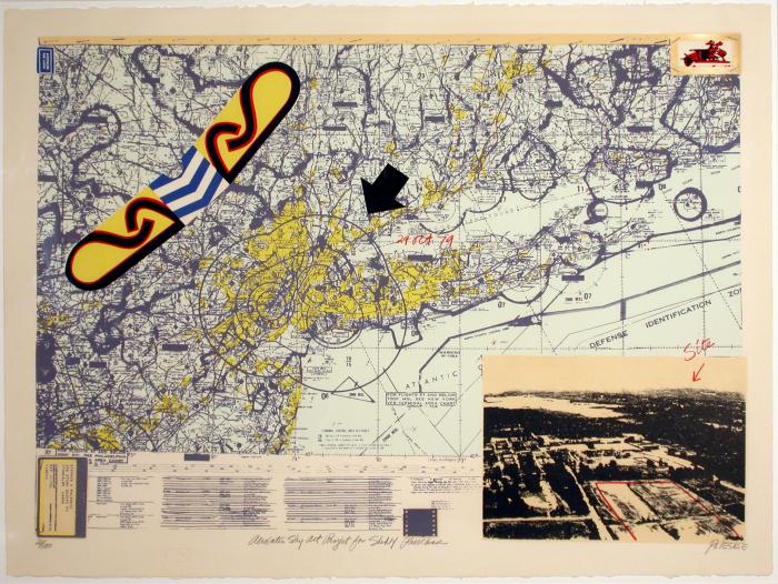
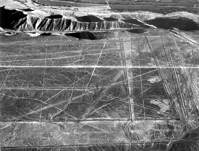
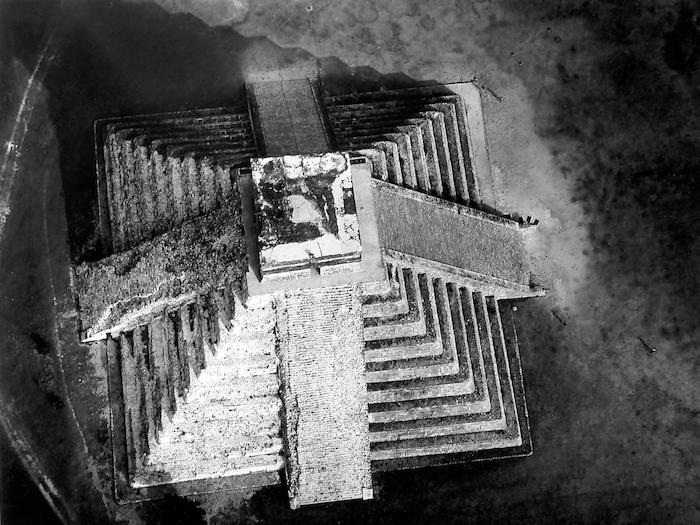
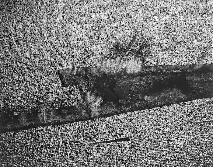
In Robert Smithson’s Torn Photograph from the Second Stop (rubble), n.d., a photograph of nondescript rubble is torn into four near-equal sections. No longer part of a larger natural landscape, Smithson’s debris enters the realm of man-made experience. He charts a course that points toward depletion and exhaustion as both nature and culture disintegrate around us; perhaps in the end it’s their mutual cancellation that continues to propel us forward. The man-made intrusions that mar the landscapes in Marilyn Bridges’ photographs and Stephen Poleskie’s prints are what make the images more compelling. Bridges’ aerial photographs of remote landscapes are sharply incised by things unseen by the grounded eye; Poleskie’s prints of imaginary flight maps are riddled by unknown targets. Both artists heighten perceptions of unfamiliar terrain by mapping out and honing in on elusive boundaries.
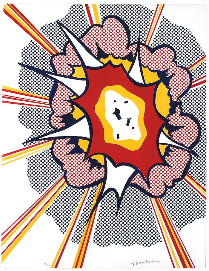
Shifting destinations mark the course of many contemporary artists’ best digressions; it’s what keeps art moving and I, for one, like the ride. Pop art: manic, foolish, dangerous, cluttered, pathetic, exhilarating; call it real life, only shinier. The metaphoric snap in Roy Lichtenstein’s comic assaults like Explosion, 1967, make me want to come up for air, and when I do I know that I’m not breathing something pure or rarefied. Rummaging beyond the fray, collecting trash, filling the gaps is Robert Rauschenberg, who wrings a visceral poetry out of life’s detritus. He’s not like Lichtenstein, who serves it up big and silly, or like Paolozzi, who brings it together clearly and brightly, or like Warhol, who hones in on it only to shrug and walk away. For Rauschenberg, art’s about the hard-won renewals that follow life’s ironic, poignant, violent, beautiful obfuscations. In Storyline I (Bonnie and Clyde), 1968, or The Week in Review, 1973, images from movies, magazines, and newspapers are partially wiped out; Rauschenberg’s layer of violation on top of the initial saturation becomes a conflicting act of reclamation and disavowal. In Revolver, circa 1967, five Plexiglas disks are silk-screened with images cropped from ads and art history. By gently turning the disks, an endless combination of images is revealed and concealed; this time Rauschenberg lets the viewer determine the course. His open-endedness leads me down a thousand paths; at times this type of freedom is revelatory, at other times it’s debilitating.
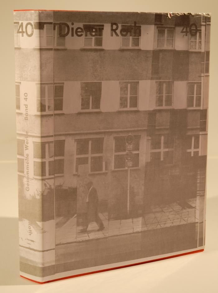
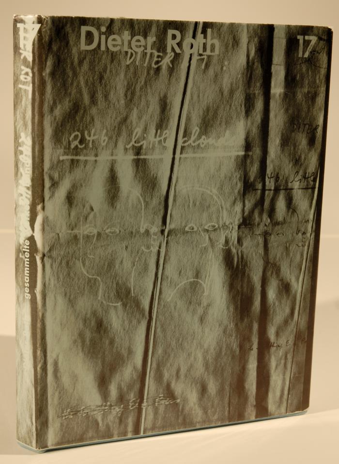
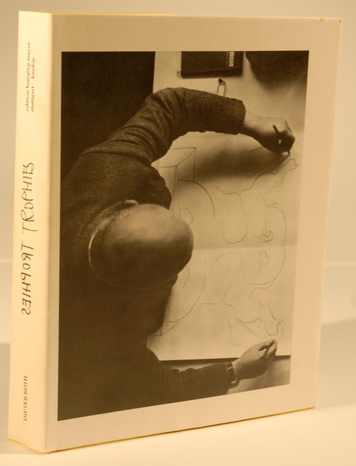
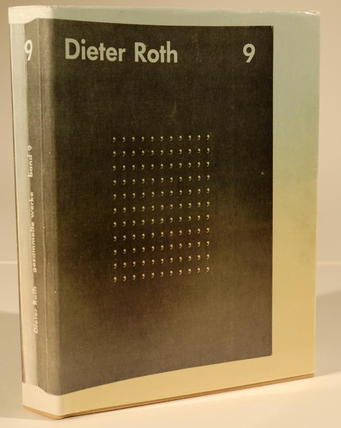
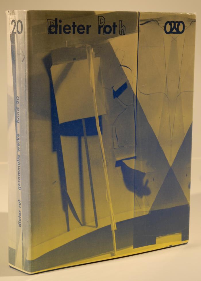
Looking for temporary solace, I turn to the work of artists whose vision is so impenetrable that impure moments never sully the view. Clarity abounds in the eloquently distilled vision of Ellsworth Kelly or the unitary world of Donald Judd—and then it’s back to the fray. Dieter Roth’s artist books and his Speedy Drawings deliver a visceral, pungent response to all that life offers. Whether contained within the pages of his books or let loose in the reckless focus of his drawings, Roth’s approach takes nothing for granted. Through the combined forces of inclusive vision and audacious hand, Roth’s experimentation with unlikely art materials such as cheese, chocolate, and molded dung further the stakes of making art out of dross. He takes a mordant look at the life of the artist in his book Gesammelte Werke, Band 17, 1962. Filled with comic sketches, cryptic messages, and confessional musings, the book calls to mind similar efforts by R. Crumb, Philip Guston, and more recently Sean Landers. In his book, Roth writes:
The less you show the more I see
The more you show the more I see
The more you show the less I see
The less you show the less I see…
I accept these words at face value. Like Lou Reed and John Cale’s song about Warhol, they too are an ode to persuasive images; and contained within their contradictions are the chords of this artist/curator’s unceasing infatuation with the nature of persuasive images, in and beyond this exhibit.